SDAM
 View Figma Design File
Project Overview
Challenge
Design a responsive website for a conceptual public art museum to advertise exhibitions and events, provide museum information, and enable patrons to schedule visits.
Audience
San Diego residents and visitors, ranging from individuals, couples, families, and groups of friends, to school and work groups. It caters to people with an interest in art, as well as those simply looking for an engaging activity to enjoy alone or with others.
Goal
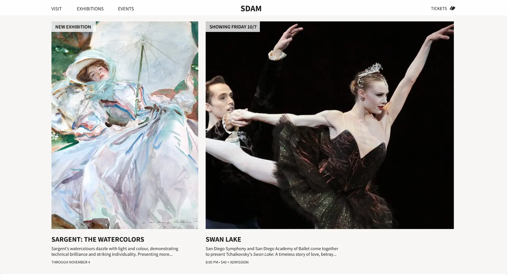
Create a responsive website that prioritizes intuitive user task flows and a minimalist, aesthetic design. The goal is to provide users with an effective and enjoyable experience while positioning SDAM as a trendy and engaging place.
Role
Individual Project, UI/UX Designer
Execution
Design Thinking Process: Empathize, Define, Ideate, Prototype, Test
Tools
Figma, Dalle-3, Lucidchart
1. Empathize
User Personas

Cam
Age: 21 years old
Education: B.A. Design
Occupation: Student
Location: San Diego, CA
Bio
Cam is a 3rd year graphic design student who is passionate about art. He recently asked a classmate out on a date and mentioned visiting the local art museum.
Goals
- Find information related to current exhibitions, ticket prices, hours, and events for young adults
- Determine if SDAM is a good location for a first date
- Purchase tickets for him and his date
Frustrations
- First date butterflies
- Difficulty finding fun date ideas

Kira
Age: 36 years old
Education: B.A. Education
Occupation: Teacher
Location: San Diego, CA
Bio
Kira is an elementary school teacher passionate about providing engaging and educational experiences for her students. She is searching for potential field trip locations which integrate with her lessons and inspire creativity and critical thinking in her students.
Goals
- Find information related to elementary school visits, current exhibits, and prices
- Schedule a visit for her class
Frustrations
- Unsure if the museum has offerings for elementary students
- Not tech-savvy and hates complicated online processes
User Stories
Cam: As a college student going on a date I want to find information on the museum's exhibitions, events, ticket prices, and hours so that I can decide on attending and plan my visit.
Kira: As an elementary school teacher I want to see if the museum offers any educational resources, tours, or work shops for elementary-aged students so that I can take my class on a fun, inspiring, and educational field trip
2. Define
Problem Statements
Cam is a college student who needs to quickly find out information on pricing, hours, workshops, and current exhibitions at the museum because he is deciding on a place to take his date.
Kira is an elementary school teacher who needs to find information and schedule a school visit at the museum because she wants her class to have a fun, inspiring, and insightful field trip.
Hypothesis Statements
If Cam visits the museum website then he will efficiently find basic museum information so that he can decide on visiting.
If Kira visits the museum website then she will efficiently find information on the museum's school programs and be prompted to schedule a visit for her class
Goal Statements
The museum website will let users efficiently find basic museum information which will affect all potential museum visitors by saving them time and frustration and allowing them to make a clear and informed decision on whether or not to attend. Effectiveness will be measured by tracking museum attendance.
The museum website will let users efficiently find information and schedule group visits which will effect adult, college, k-12, and disabled groups and group coordinators by preparing them for their visit and saving them time and frustration. Effectiveness will be measured by tracking museum group visits.
3. Ideate
Competitive Audit
Goal: Analyze the information architecture, interaction, and visual design of competitors' homepage, navigation, ticket purchasing, and group visit scheduling to identify strengths and weaknesses, generating insights that will inform the design direction.
MOMA
Successes
- Colorful interface with attention grabbing imagery
- Simple and easy to understand information architecture
- Unique and aesthetic layout
- Top level pages not hidden in a dropdown on mobile
- Full screen navigation dropdown focuses attention on current task
- Calender tool to select ticket date
Drawbacks
- Group visits and school programs are hidden under "Book a tour"
- No labels on homepage to indicate whether an item is an exhibition, event, film series, etc.
Louvre
Successes
- Elegant UI
- Large font paragraph with links to main attractions on home page
- Progress bars indicating and linking to page sections
- Dedicated social media sections displaying recent posts
- Calender tool to select ticket date
Drawbacks
- Duplicated nav adds complexity and point of possible confusion
- Dropdown nav on desktop adds clicks and hides nav items
- School visits aren't highlighted and are difficult to find
- No distinction between school and group visits
- Ticket purchase and group reservation pages looks dated and different to the rest of the site
The Met
Successes
- Above-the-fold home page video gives users a live view of the museum across varying scenes and attractions
- Side scrolling list of all exhibitions
- Buy tickets not hidden on mobile
- Detailed museum hours near top of homepage
Drawbacks
- Mobile menu has a dated appearance and lacks animation
- Mobile menu has no visual difference in hierarchy between parent category and subpages
- Side-scrolling elements appear similiar to non-side-scrolling elements on mobile
Sitemap
The sitemap was designed to streamline navigation, minimize the number of pages, enhance discoverability, reduce clicks, and prioritize key user flows. The Figma design file is linked in the next section for reference.
4. Prototype
High-Fidelity Prototypes
View Figma Design File5. Test
User Testing has not been conducted for this project.
Takeaways
Completing a comprehensive high-fidelity mockup of the homepage before developing a design system or working on additional pages helps concentrate design efforts. This approach facilitates testing and validating visual design elements in a single, real context, ensuring their effectiveness before broader implementation.
Next Steps
- Create a design system
- Finish UI design of website subpages on desktop and mobile
- Conduct usability studies on desktop and mobile
- Continue to iterate and improve visual design and UX
 Next Work: Pattern